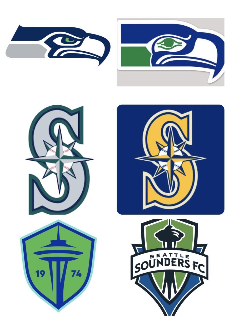
The Seattle Sounders recently announced that their logo will change as of 2024, and I feel that it’s time to stand up for what I believe in: Seattle’s past sports logos are better than the present ones. From the blue and yellow of the past Mariners logo to the vintage appearance of the former Seahawks logo, Seattle has slowly downgraded our sports logos over the last 20 years.
To gain information about what people think about Seattle sports logos, I interviewed random individuals at MIHS to garner opinions about three of the old and new Seattle sports logos.
MIHS history teacher Jamie Robertson enjoys the past Seahawks look more than the current one.
“I love the colors,” Robertson said. “Bold, bright and it simply pops out. I love the green on the older one, and the logo is slightly bigger, so there’s just no doubt in my mind. The old [Seahawks] logo is perfect.”


However, some students at MIHS find the current Seahawks logo more appealing. “The current logo is better, but I actually liked the throwback uniforms using the [old logo],” MIHS student Arman Najafian said.
Robertson also finds the past Mariners logo more appealing. “I like the blue and yellow again,” Robertson said. “It’s simple, bright with a nice contrast between the two colors.”
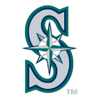
However, Najafian disagrees, as he finds that the yellow and blue colors “don’t have a lot to do with Seattle. It’s yellow and blue, not Seattle’s traditional green and blue,” Najafian said.
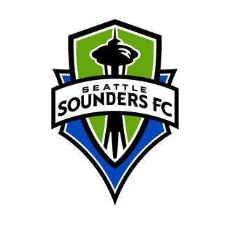
Robertson and Najafian’s opinions align when it comes to the new Sounders logo.
“I definitely liked the current one more,” Najafian said. “Even though the new logo is a little more minimalistic, the current one’s just classic. You gotta keep the words, and you don’t really need to change it when it makes it worse.”

“I’d probably go for the current one, again for that same kind of bolder and brighter look,” Robertson said. “It’s more descriptive, so I’d definitely keep the current one.”
With this knowledge, I’ve concluded that the public’s preferences for the past or current Seattle sports logos end up being a 50/50 split between love and hate. Personally, I think that all three past logos are more eye-catching, unique and individually more engaging to look at. The current Seahawks and Mariners logos are both more modern in many people’s eyes, but what I’m seeing is slightly dull.
The perfect example of this modernization of logos is in the revamped Sounders logo. This new logo is very corporate or bland, and quite unnecessary, while the current one is a classic staple for the city of Seattle as it was the original logo used when the Sounders were formed in 2009. They thought a change of pace was necessary, but this certainly wasn’t the right call to increase engagement.
So, to all of the Seattle sports confederations, please incorporate a blast from the past and reinstitute the retro Seattle sports logos (or at least the original Sounders logo, please!).